
Theme
The use of themes allows you to save time on the design of your experiences but also to keep visual consistency. Allowing you to be easily recognizable by your customers.
Quick Access
Create a theme
You can create and manage your theme on Settings → Theme → New Theme
You can also directly save a theme on the fly from any experience.


First, you will have to name the theme. Then, you can modify every property for every element you use in your experiences.
Theme Dashboard

A (New Theme Button):
Use this button to access the theme builder. It initiates the setup where you can name your theme and define the initial design settings, ensuring a consistent appearance across different parts of your product.
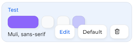
B (Theme Overview):
This area displays all your existing themes. Each theme card shows the primary colors and fonts used, making it easy to identify and choose the right theme for specific needs.
C (Theme Options Menu):
Available through a dropdown on each theme card. This menu allows you to:
Edit details of a theme with our builder.
Duplicate a theme to customize it further.
Set a theme as the default for new experiences.
Delete themes that are no longer needed.
D (Smart Theme):
This feature automatically generates a theme based on the colors from a specified URL. It simplifies the process of matching your app’s design to your corporate branding or a specific website, enhancing the overall coherence and user experience.
Theme Builder
This tool is essential for setting a standard visual style that can be easily applied across various user experiences within the app. Here’s a detailed breakdown of its layout and functionalities:

A (Header with Theme Naming and Navigation):
Use this area to name your theme or navigate back to the builder. It's important to choose a clear, descriptive name for easy identification.
B (Save and Cancel Buttons):
Located at the top-right, the "Save" button commits your changes, while the "Cancel" button discards any unsaved adjustments. This is particularly useful when editing an existing theme, as you can revert to the original settings if needed.
C (Component Settings Example):
This section displays adjustable settings for a selected component, such as color, borders, and shadows. It's where you can tweak the aesthetics to align with your branding.
D (Full Component List):
This comprehensive list includes all components like Steps, Hotspots, and CTAs. You can expand each category to access and modify its specific parameters, ensuring consistency throughout your theme.
E (Preview Type Selector):
Use this dropdown to choose the type of preview you want to see, such as a tooltip or a modal. It helps in visualizing how each element will appear in different contexts.
F (Live Preview Area):
The preview window shows real-time updates as you adjust settings, providing a visual reference to ensure the theme looks great and functions well across all user interactions.
Each change made will be automatically repeated on experiences using the same theme.
Smart theme
The smart theme allows you to auto-generate a team based on the colors of an existing website. For this, you must name your theme and give the URL of the site you use as a template.
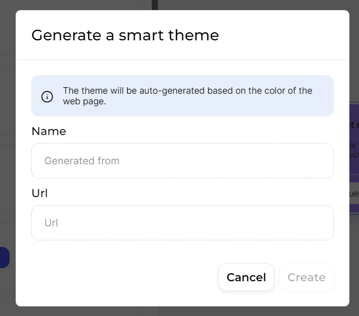
Then a theme will be automatically generated. You can edit it if needed by clicking on “Edit”
The Smart Theme feature only works with public websites.
If the URL provided is from a private or restricted access page, the theme generation may not work properly.
Use a theme
To apply a theme to an experience, once in the builder, go to the “Theme” section on the lateral menu.

Then, click on the theme you want to use and the design will automatically change according to the settings.
It's just a preview, you need to apply the theme to save the changes and it will apply to all steps.

A (Save as New Theme): If you've set up a design that you like, you can save it as a new theme here. This is useful for keeping your designs organized and quickly applying them to other experiences.
B (Smart Theme): Use the Smart Theme feature to automatically generate a theme based on the colors of a specific URL. This is a great tool for quickly matching your user experience to your brand colors. By default, it suggests a theme from the URL of the page currently open in the builder if editing in-app.
C (Theme Selection): This area shows all your saved themes. Simply click on any theme to see how it looks on your current project. This instant preview makes it easy to decide which theme works best.
D (Update or Apply Changes): Whenever you make adjustments to a theme, a pop-up will appear giving you the option to update your default theme with these new changes or apply the changes across all steps in your experience.
Last updated