> For the complete documentation index, see [llms.txt](https://help.usejimo.com/docs/llms.txt). Markdown versions of documentation pages are available by appending `.md` to page URLs; this page is available as [Markdown](https://help.usejimo.com/docs/experiences/banners/components.md).
# Components
Discover key components for crafting Banners in Jimo. Enhance banners with Text and Interaction assets to ensure a comprehensive and informative alert.
## Components for Building Banners
### **Banner (Single-Step)**
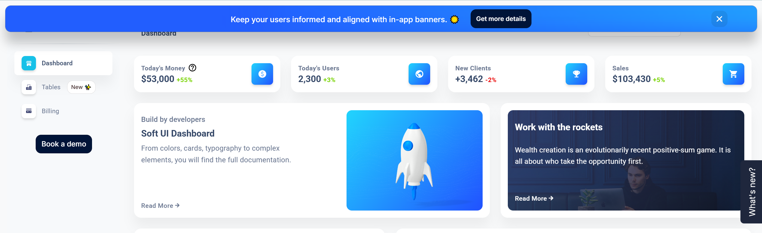
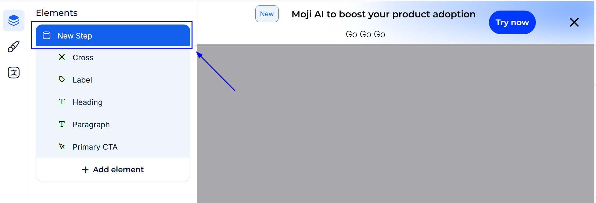
Unlike multi-step Tours or Surveys, a Banner is **one component** displayed in a defined area of your product interface. It can host text, CTAs, or other elements—all configured in one consolidated “step.”
> **Ideal for**:
>
> * Simple announcements or promotional snippets.
> * Brief alerts, reminders, or calls to action.
> * User-friendly, unobtrusive messaging that stays visible without interrupting flow.
***
## Customizing Your Steps
Though there’s only a **single banner step**, you can still add various elements to shape its content and style. Each element is fully configurable in the **Content Builder**, ensuring your banner fits your branding and objectives.
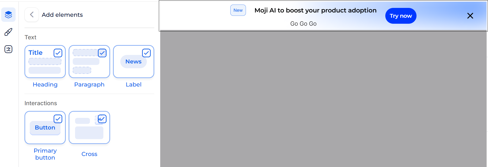
### Add Elements
{% hint style="info" %}
**Centering Elements**
If you remove the title or body text, the remaining elements will stay centered by default.
{% endhint %}
### Available Elements
Components building blocks
Text Elements
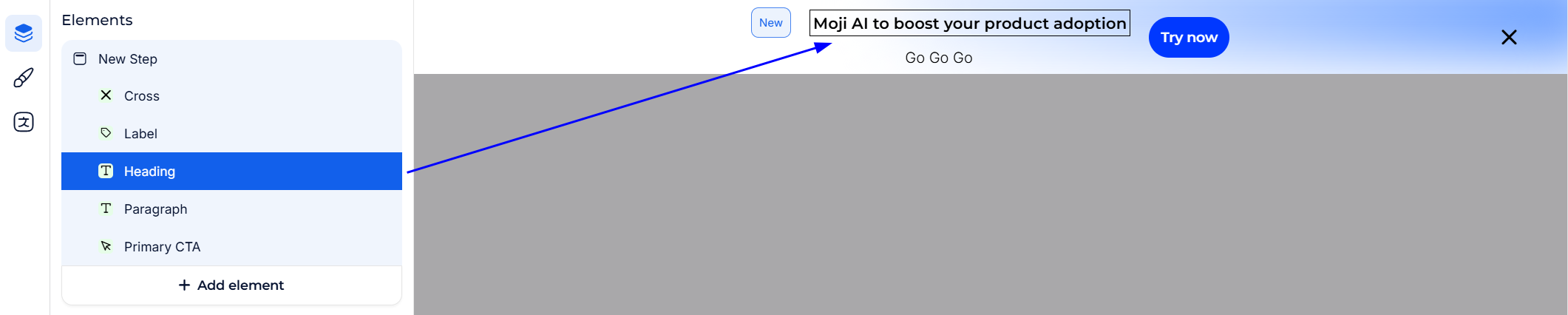
* **Heading:**
Craft compelling titles and headers to grab attention and set the context.
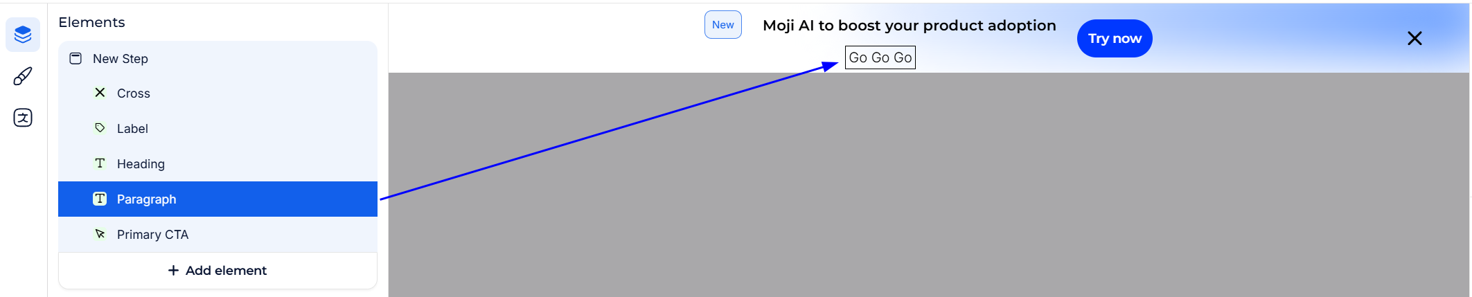
* **Paragraph:**
Convey detailed information with descriptive text to guide users through the experience.
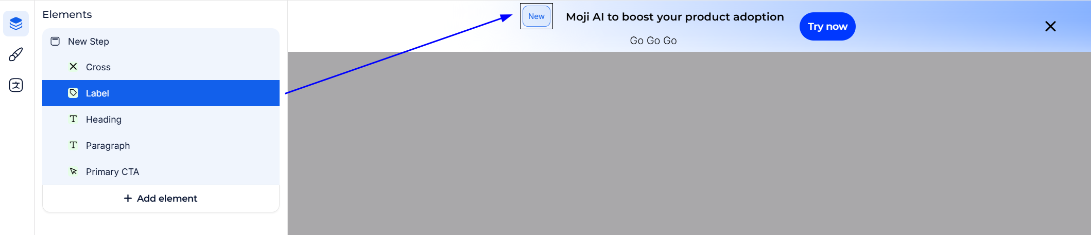
* **Label:** \
Use labels to annotate interactive elements for clarity.
Interactions
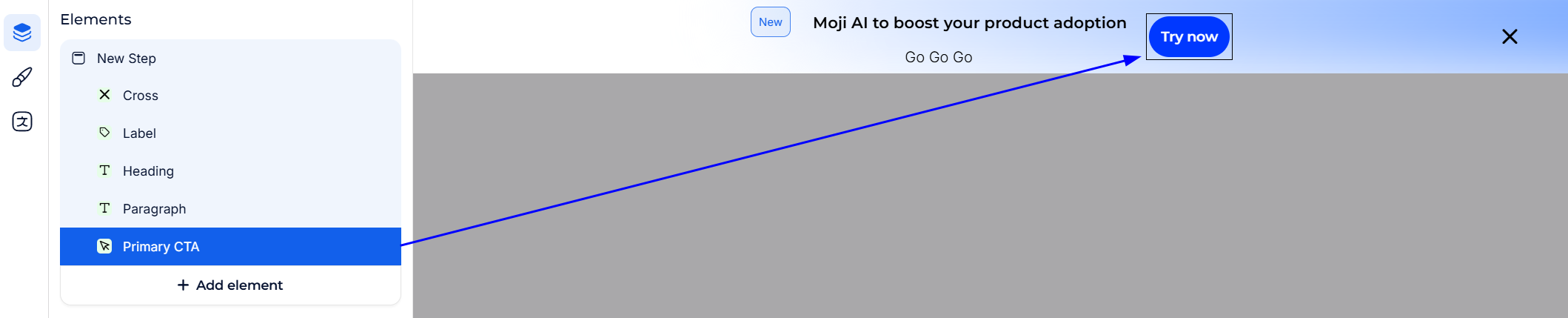
* **Primary Button (CTA):** \
Encourage users to take action with a prominently styled button.
* **Cross:** \
Allows users to dismiss or snooze the experience by clicking a closing cross in the corner.
***
## Elements Parameters
In a Banner’s **single-step** structure, parameters define both the overall banner style and each added element’s behavior or styling.
### Main Step
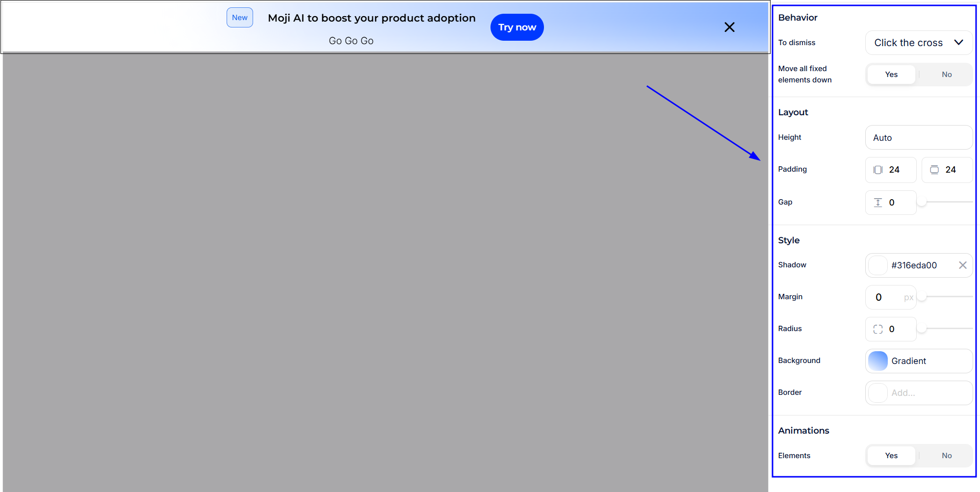
When you click on the top of the [navigator](https://help.usejimo.com/help-center/using-jimo/~/changes/Cm3LFsDmjpOrhMLW0b5u/build/navigator) arborescence, you access the **Main Step Parameters**.
These parameters are organized into different sections within the parameter sidebar, allowing comprehensive customization from top to bottom.
Behavior
Defines how users can dismiss the banner and whether it affects the layout of other elements on the page.

* **To Dismiss:** Allows users to close the banner via different interactions.
**Options:**
* **Click the Cross:** A close icon dismisses the banner.
* **Click Outside:** Clicking anywhere outside the banner closes it.
* **Both:** Users can dismiss by cross **or** outside click.
* **Cannot Be Dismissed:** The banner stays on-screen until hidden via CTA.
* **Move All Fixed Elements Down:** Toggles whether the banner **pushes** other fixed-position elements (e.g., nav bars) downward when appearing.\
**Options:**
* **Yes:** Adjusts surrounding fixed elements, maintaining space and preventing overlap.
* **No:** Displays on top, possibly overlapping any existing fixed elements.
{% hint style="warning" %}
**Exclude elements from push-down**
When **Move all fixed elements down** is set to **Yes**, you can prevent specific fixed elements (e.g., sticky nav bars, help/chat launchers) from being shifted.\
\
Add the following HTML attribute to the element that should **not** move:
```html
```
This attribute is boolean (no value required). Only the marked element is ignored; other fixed elements are still pushed down.
{% endhint %}
Layout
Controls **height, padding, and spacing** within the banner, shaping how your text and elements fit.

* **Height:** Determines the vertical space the banner occupies.\
**Options:**
* **Auto:** Adjusts to fit content automatically.
* **Custom:** Use a slider or direct input to set a pixel value (e.g., 60px).
* **Padding:** Adds internal spacing between the banner edge and its content.\
**Options:**
* **Vertical:** Enter a pixel value for top/bottom spacing.
* **Horizontal:** Enter a pixel value for left/right spacing.
* **Gap:** Specifies the distance between text blocks or paragraphs within the banner.\
**Options:**
* **Slider or Direct Input:** Use pixels to define spacing (e.g., 8px).
Style
Customizes the overall visual appearance, from shadows and margins to background color or gradient.

* **Shadow:** Adds depth behind the banner.\
**Options:**
* **Color & Offsets**: Choose a color, set X/Y offsets, define blur intensity.
* **Remove**: Click the cross to disable the shadow.
* **Margin:** Determines extra spacing outside the banner’s boundary (e.g., above/below the banner for partial overlays).\
**Options:**
* **Top/Bottom**: Enter pixel values to create margin above/below the banner.
* **Radius:** Adjusts how rounded the banner’s corners are.\
**Options:**
* **0% (Sharp)**: Square corners.
* **50% (Fully Rounded)**: Pill-shaped corners.
* **Background:** Defines the main color or gradient behind the banner’s content.\
**Options:**
* **Color Mode (Single Color)**: Simple solid color.
* **Gradient Mode**:
* **Color 1 & Color 2**: Pick your two gradient colors.
* **Classic/Animated**: Choose between a static gradient or a dynamic, moving effect.
* **Border:** Adds an outline around the banner.\
**Options:**
* **Color**: Select a border color; remove by clicking the cross.
Animation
Controls whether the elements within the banner fade into view when the banner appears.

* **Elements:** Toggles a fade-in animation for all child elements within the banner.\
**Options:**
* **Yes**: The elements within the banner fade into view as the banner appears.
* **No**: The elements remain static and appear instantly without any animation effect.
***
### Generic Elements
This section groups parameters specific to common element types used within your Banners. Each element has its own customization options to enhance functionality and visual appeal.
**Cross**
Provides users with a way to dismiss or snooze the experience.
Behavior
Defines how the cross behaves when interacted with by the user.

* **Actions:** Defines what happens when the cross is clicked.
* **Options:**
* **Dismiss:** Closes the experience and logs it as dismissed in the statistics.
* **Snooze:** Temporarily hides the experience (only available on the first step).
Style
Customizes the visual appearance of the cross.

* **Font Size:** Sets the size of the cross icon in pixels.
* **Options:**
* Enter a value directly or use a slider to adjust.
* **Radius:** Adjusts the roundness of the cross box corners.
* **Options:**
* Percentage value to define edge roundness from sharp to fully rounded.
* **Color:** Defines the color of the cross icon.
* **Options:**
* Select a color using the color picker or enter a hex code.
* **Background:** Adds and selects the color of the cross background box.
* **Options:**
* Choose a background color or remove it by clicking the cross icon.
***
**Label**
Adds a text label to annotate elements within the step.
Content
Manages the text displayed on the label.

* **Text:**\
Defines the text displayed in the label.
* **Options:**
* Enter the desired label text.
Layout
Configures the styling and positioning of the label.

* **Font Family:**\
Choose the font for the label text.
**Options:**
* Select from available font families.
* **Font Size:**\
Sets the font size for the label text in pixels.
**Options:**
* Enter a value directly or use a slider.
* **Font Weight:**\
Adjusts the boldness level of the label text.
**Options:**
* Choose from options such as normal, bold, bolder, lighter, etc.
* **Text Color:**\
Defines the color of the label text.
**Options:**
* Select a color using the color picker or enter a hex code.
* **Background:** *(Optional)*\
Sets the background color of the label.
**Options:**
* Choose a color using the color picker or remove it by clicking the cross icon.
* **Border:** *(Optional)*\
Adds a border around the label.
**Options:**
* Select the border color using the color picker or remove it by clicking the cross icon.
* **Padding:**\
Adds padding inside the label between the text and its borders.
**Options:**
* **Horizontal Padding:** Specify padding in pixels.
* **Vertical Padding:** Specify padding in pixels.
* **Radius:**\
Adjusts the roundness of the label corners.
**Options:**
* Enter a percentage or pixel value to define corner roundness.
***
**Heading**
Adds a prominent title to the step for emphasis and context.
Content
Manages the title text and its advanced styling options.

* **Title Text:**\
Edits the title text with advanced styling options.
**Options:**
* **Text Editor Features:**
* **Bold:** Make text bold.
* **Italic:** Italicize text.
* **Underlining:** Underline text.
* **Insert Hyperlinks:** Add clickable links.
* **Emoji Finder:** Insert emojis.
* **Text Variables:** Insert dynamic user data (e.g., user’s name) that auto-updates based on the viewer.
Style
Customizes the visual appearance of the heading.

* **Color:**\
Defines the color of the title text.
**Options:**
* Select a color using the color picker or enter a hex code.
* **Font Family:**\
Chooses the font for the title text.
**Options:**
* Select from available font families.
* **Font Size:**\
Sets the font size for the title text in pixels.
**Options:**
* Enter a value directly or use a slider.
* **Font Weight:**\
Adjusts the boldness level of the title text.
**Options:**
* Choose from options such as normal, bold, bolder, lighter, etc.
***
**Paragraph**
Adds descriptive body text to provide detailed information within the step.
Content
Manages the paragraph text with advanced formatting options.

**Text:**\
Edits the paragraph text with advanced formatting options.
**Options:**
* **Text Editor Features:**
* **Bold:** Make text bold.
* **Italic:** Italicize text.
* **Underlining:** Underline text.
* **Insert Hyperlinks:** Add clickable links.
* **Emoji Finder:** Insert emojis.
* **Bullet Points:** Create lists with bullet points.
* **Multiple Paragraphs:** Add new paragraphs with line breaks.
Style
Customizes the visual appearance of the paragraph.

* **Color:**\
Defines the color of the paragraph text.
**Options:**
* Select a color using the color picker or enter a hex code.
* **Font Family:**\
Chooses the font for the paragraph text.
**Options:**
* Select from available font families.
* **Font Size:**\
Sets the font size for the paragraph text in pixels.
**Options:**
* Enter a value directly or use a slider.
* **Font Weight:**\
Adjusts the boldness level of the paragraph text.
**Options:**
* Choose from options such as normal, bold, bolder, lighter, etc.
***
**Primary CTA**
Encourages users to take a primary action within the step.
Behavior
Defines the [actions triggered](/docs/build/triggers-and-conditions/steps-triggers.md#types-of-actions-then) when the CTA is clicked.

**Actions:**\
Defines the actions triggered when the CTA is clicked.
**Options:**
* **Close banner (default):** Can't be removed, CTA click will close the banner and count it as a completed experience.
* **Redirect:** Redirects the user to a specified URL.
* **Trigger Experience:** Initiates another experience.
* **Open Post:** Trigger the changelog open on a specific post.
* **Combine Actions:** Allows multiple actions to be executed upon click.
Size
Adjusts the width style of the CTA button.

**Width:**\
Chooses the background style of the CTA.
**Options:**
* **Fit:** Adjusts the CTA width to fit the text content.
* **Fill:** Extends the CTA to fill the entire available width.
Layout
Customizes the content and styling of the CTA button.

* **Text:**\
Edits the text content of the CTA button.
**Options:**
* Enter and style the desired button text.
* **Font Family:**\
Chooses the font for the CTA text.
**Options:**
* Select from available font families.
* **Font Size:**\
Sets the font size for the CTA text in pixels.
**Options:**
* Enter a value directly or use a slider.
* **Font Weight:**\
Adjusts the boldness level of the CTA text.
**Options:**
* Choose from options such as normal, bold, bolder, lighter, etc.
* **Padding:**\
Adds padding inside the CTA button between the text and the button borders.
**Options:**
* **Vertical Padding:** Specify padding in pixels.
* **Horizontal Padding:** Specify padding in pixels.
* **Radius:**\
Sets the roundness of the CTA button corners.
**Options:**
* Enter a percentage or pixel value to define corner roundness.
* **Text Color:**\
Defines the color of the CTA text.
**Options:**
* Select a color using the color picker or enter a hex code.
* **Background:** *(Optional)*\
Sets the background color of the CTA button.
**Options:**
* Choose a color using the color picker or remove it by clicking the cross icon.
* **Border:** *(Optional)*\
Adds a border around the CTA button.
**Options:**
* Select the border color using the color picker or remove it by clicking the cross icon.